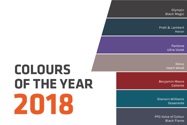
The holiday season has finally set in! It’s time to say our goodbyes to 2017. Time to restart, rethink and re-strategize for 2018. While Pantone has just released its ‘Color of the year’ as they do every year, we thought this would be a good opportunity to compile a review of other Colors of the Year! We picked out what 6 of the industry’s foremost brands have to say about color trends for 2018. Keep reading to get an insight on do’s and don’ts’ for home remodeling projects for the new year!
Pantone Color of the Year : Ultraviolet
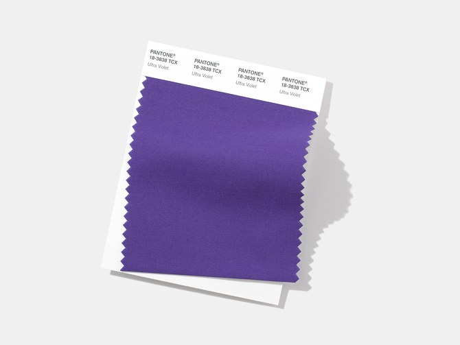
While a lot of thought goes into selecting the color of the year, this surely has no impact on exterior home trends for 2018. Pantone describes the color as inventive, imaginative and ingenuine and we think this is a great attitude to bring in the new year!
We are all about the color. Our recent survey with over 800 homeowners told us that homeowners find it most difficult to make and visualize color selections over anything else in their remodeling project. So as contractors, color drives a lot of the critical decisions around remodeling.
Benjamin Moore – Caliente
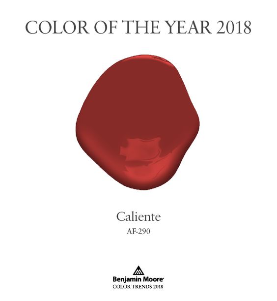
This color is the epitome of bold and dramatic. We think this works best as an accent wall color. Benjamin Moore’s Caliente is perfect to uplift a boring space, re-energise a room and as they stated, adds confidence to your home.
Tip: Use this color wisely too much can get overwhelming. Find the right balance by using Caliente with whites and earthy browns.
Sherwin Williams – Oceanside
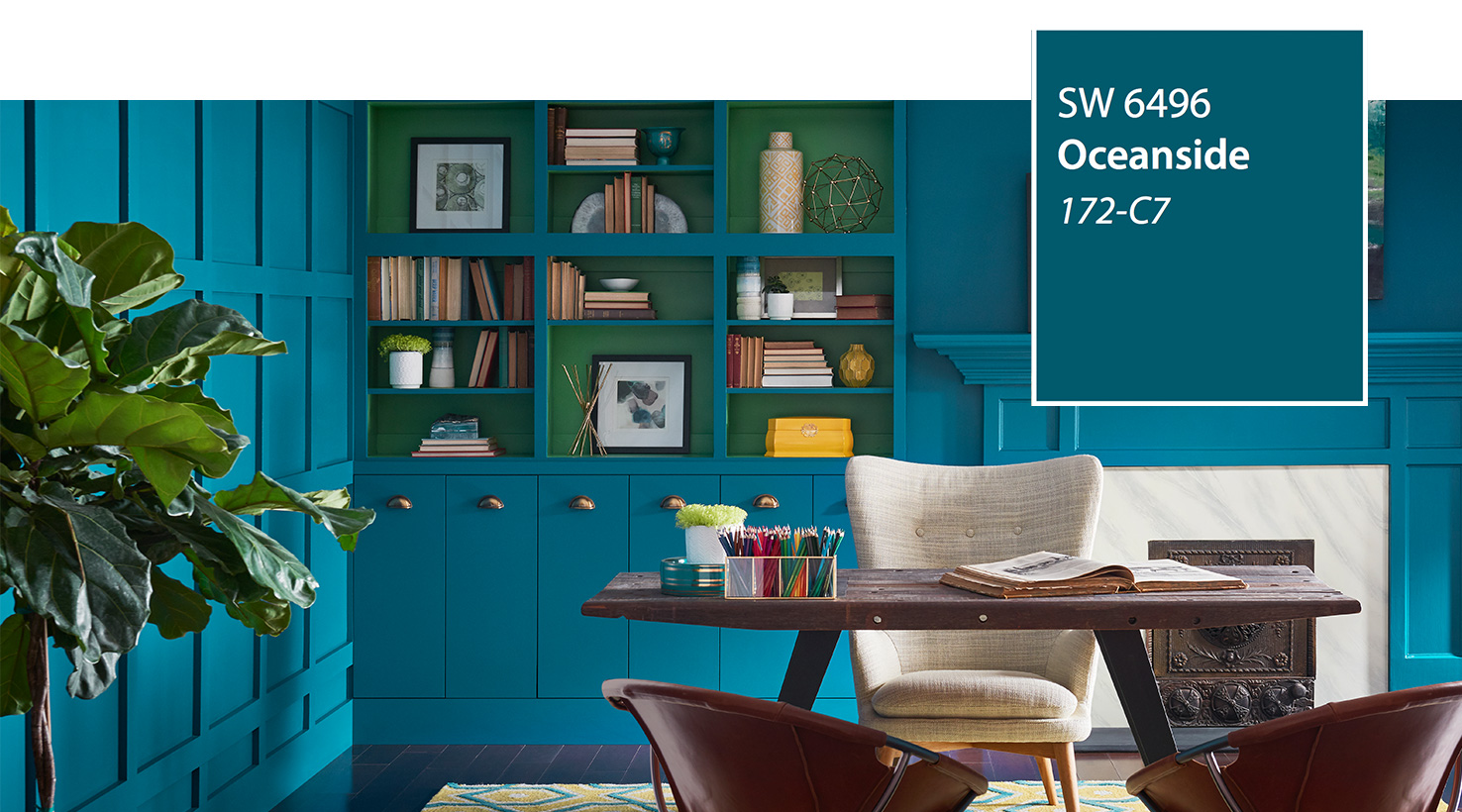
This seaside inspired color is one of our favourites. Sherwin Williams – Oceanside is both familiar and unpredictable, primary yet elegant. This is what the color experts at Sherwin Williams have to say;
“A complex, deep color that offers a sense of the familiar with a hint of the unknown, Oceanside, bridges together a harmonious balance of blues and greens that can be found in what’s old and new.
Oceanside is universal when it comes to design style from mid-century modern to Mediterranean-inspired, traditional to contemporary.”
Tip: Thinking of a color for a statement front door? I think we found a winner! We would pair this color with gold metallic accessories (as recommended by Sherwin Williams) and light gray hues.
Olympic – Black Magic
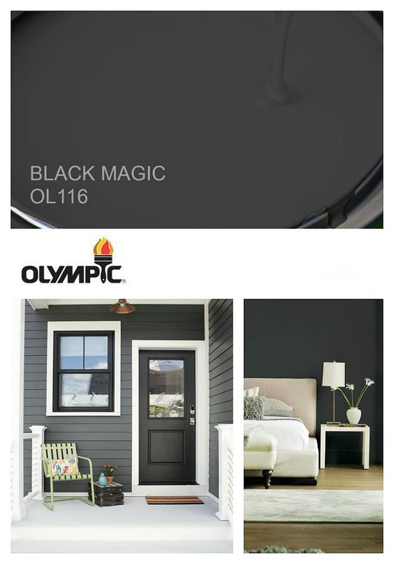
Olympic’s 2018 color of the year is Black Magic and let us tell you – it is indeed magical. With a dark gray undertone this contemporary color fits well anywhere! It goes with wooden accents, whites, bright colors and neutrals. You can’t go wrong here.
Tip: We have two words for you – Black. Trim.
Do your clients struggle with product and color selections for their home remodeling project? Chat with our Sales Consultant to learn more about Renoworks Pro.
Pratt & Lambert – Heron
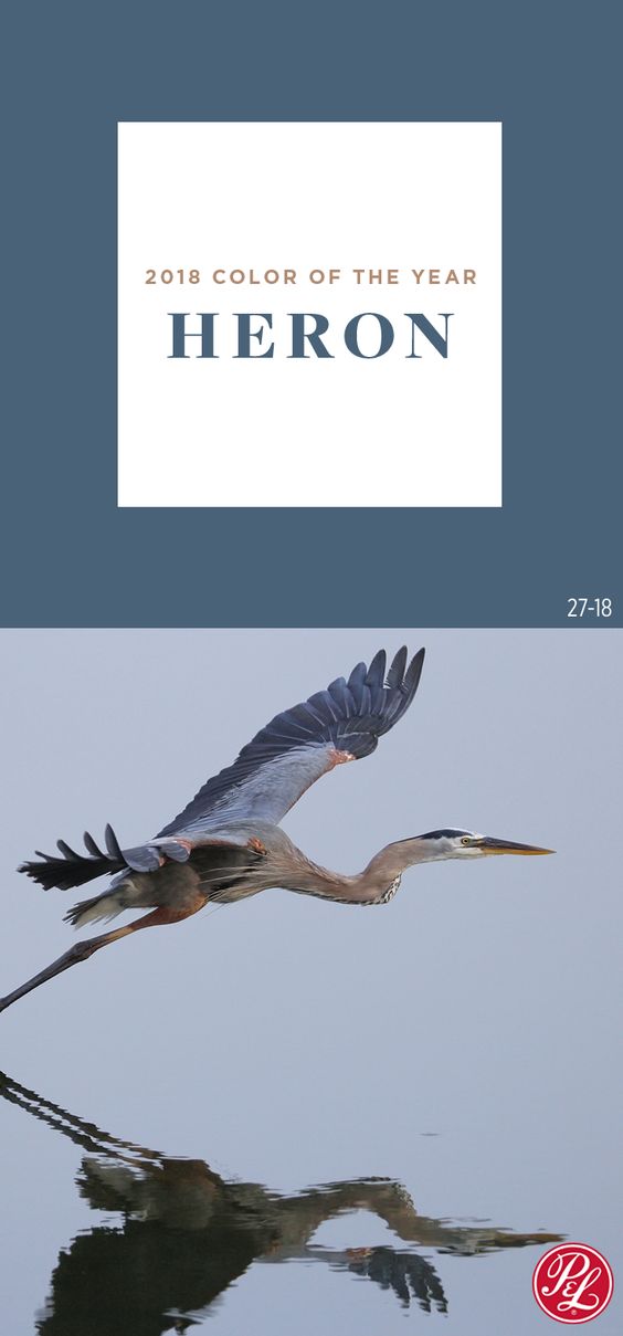
Pratt & Lambert’s Heron is a rich beautiful teal-blue color. The calming affects shine through without the “beachy” undertones of nautical blues we’ve seen overwhelmingly in the past. Pratt & Lambert describes Heron as:
“Found within Intention, the color trend story that encourages finding and experiencing the joy in slow, mindful living, Heron offers the calming effect that is sought out in daily life. It is a versatile blue that provides creative individuals, from interior designers to architects and design-savvy homeowners, an opportunity to create tranquil spaces in styles ranging from traditional to contemporary. In functional spaces, like living rooms, this statement blue gives a subtle visual impact with an aura of relaxation. It inspires unplugging and spending more quality time with family and friends.”
Tip: This is a lovely color for shakes or lap siding on a contemporary style coastal home.
Dulux – Heart Wood
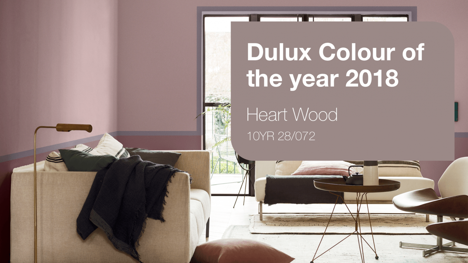
Yes, finally a neutral warm shade has made it to the list. Its chic, cozy and earthy. Dulux – Heart Wood will steal your heart for its warm pink tone.
Tip: This will go great with a minimal style home with delicate fixtures and modern décor.
PPG – Black Flame
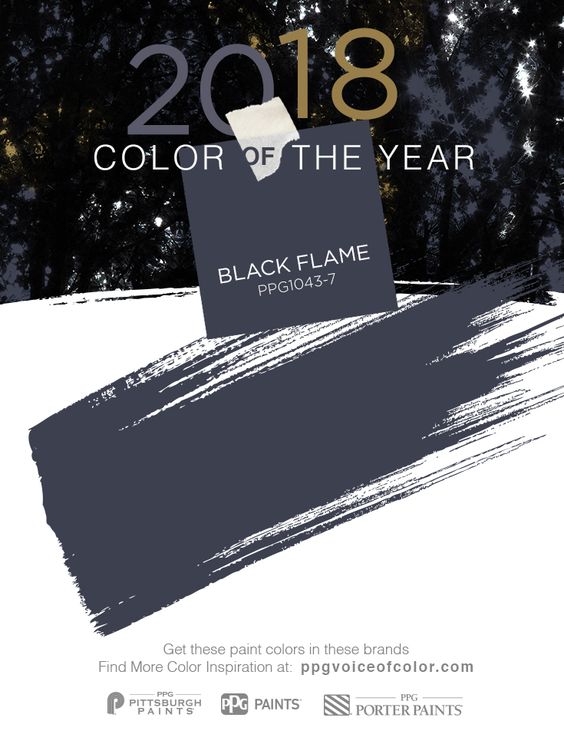
PPG’s black Flame is your go-to color here. The strong black tone with navy undertone makes it perfectly versatile as an exterior or interior color.
Tip: Use it with light shades and pastels to give a modern splash to spaces.
Check out our Pinterest Inspiration board for more ideas using these colors!